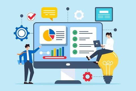
Nowhere is clarity more critical than when numbers start to speak. As companies lean heavier into automated systems, seeing information clearly becomes non-negotiable. Small shops feel it just as much as global giants - speedy insight shapes better moves. Picture charts doing heavy lifting where spreadsheets fail. These tools turn rows of digits into something eyes can grasp fast. Their role? Making sense without slowing down. Features often include drag-and-drop ease, real-time updates, plus ways to share views across teams. Hospitals map patient flow. Retailers track stock shifts. Each case shows how visuals guide choices. But hurdles remain - bad design misleads, clutter confuses. Tomorrow’s shift may bring voice-controlled dashboards or augmented reality graphs. One thing holds: when data wears the right shape, decisions follow.
Data Visualization Tools Explained
Most folks find it easier to grasp information when they look at pictures instead of long lists. These tools turn piles of numbers into visuals like bar charts, line plots, or colored heatmaps. One glance shows what might take minutes to spot in a table. Dashboards gather several views together on one screen. Maps highlight differences across locations without needing explanations. What used to hide in cells now pops out clearly. Seeing shifts over time becomes obvious with curves rising or falling. Shapes and colors replace columns full of figures.
Working across data systems, these tools link up with analytics software along with cloud storage to handle hefty amounts of information fast. Turning numbers into visuals happens next, which breaks down tough ideas so anyone can grasp them - whether they code for a living or not.
Benefits and Importance
Improved Decision-Making
When you see data clearly, it clicks quicker. That means companies act fast instead of getting stuck in rows and numbers for days on end.
Enhanced Data Clarity
Looking at data as pictures helps make sense of complicated information. Charts show patterns, links, or odd points better than rows of numbers ever could.
Increased Productivity
Out of today’s tools comes faster handling of numbers, thanks to built-in routines that skip repetitive steps. Reports show up quicker because machines handle the heavy lifting instead of people doing it by hand.
Better Communication
When teams share what they see, visuals make it easier to follow along. Without needing tech skills, people who matter grasp how things are going just by looking.
Real-Time Insights
Right now, several systems push live info, so groups can track how things are going while reacting fast when shifts happen.
Types of Data Visualization Tools
1. Dashboard-Based Tools
Out there, you’ll find tools offering dashboards where many details show up together. Business setups often rely on these within their intelligence networks.
2. Tools for creating charts and graphs
Most simple chart apps let you build bars, circles, lines - just enough to glance at numbers fast. A few clicks often does it.
3. Advanced Analytics Platforms
Out of sight, these tools mix visuals with number crunching - toss in smart algorithms that learn over time. One after another, patterns rise through forecasts built on past behavior.
4. Cloud-Based Visualization Systems
From any location, people can reach their data through cloud systems. Dashboards come alive on these networks, linking teams across distances. Collaboration grows where internet reaches, since storage adjusts itself behind the scenes. Scaling happens without extra hardware, simply by design of the setup.
5. Real-Time Monitoring Tools
From banking to tech, such systems monitor ongoing information flows while showing results through visuals. These displays update constantly, giving users a clear picture of what is happening right now across different operations.
6. Custom Visualization Software
Creating visuals that fit exact company demands is possible with certain software. A few programs let people adjust details precisely for their unique goals. Specific needs shape how graphs appear through particular applications. Tailored displays come together when using select platforms designed for flexibility. Custom charts emerge depending on which tool someone picks carefully.
practical applications and real world instances
Business Performance Tracking
One way stores keep track is through dashboards showing sales, money made, along with how customers interact. Take a clothing shop that sees its busiest times by looking at daily numbers, then adjusts staff or stock based on what the data reveals.
Healthcare Data Analysis
Tracking patient details becomes easier when hospitals bring in visual tools. Treatment results get watched closely through these systems instead of old methods. Better care often follows once services start using such updates across departments.
Marketing Analytics
When digital marketing teams check how campaigns did, they often turn to charts. Click-through numbers, along with conversion stats, become clearer when shown visually. A graph can say more than rows of data ever could.
Financial Reporting
Markets shift fast. To keep up, banks turn to visual tools that map out trends. Risk patterns emerge more clearly when seen than read. Instead of rows of numbers, charts show where investments might grow. Seeing data helps spot what spreadsheets hide. These systems turn complex figures into shapes and colors anyone can follow.
Education and Research
Some teachers plus those who study stuff pick visuals like charts when they want results to feel clearer. A graph can make numbers seem less dull while helping folks follow along without getting lost in details.
Simple Ways to Handle Everyday Tasks
Choosing the Right Tool
Pick something that fits what you actually do, maybe just drawing charts or digging into data.
Focus on Simplicity
Start clean. Messy pictures confuse people. Words should point straight to facts. Charts work better when they breathe. Fewer colors help eyes stay focused. Simplicity keeps minds on track.
Select Appropriate Chart Format
Some details fit better in charts, yet others need maps. Take numbers - often they shine in graphs instead of paragraphs
- Line charts for trends
- Bar charts for comparisons
- Pie charts for proportions
Ensure Data Accuracy
Start by checking every piece of information before making visuals. Wrong numbers can twist what you think you see.
Mobile and web ready
From phones to desktops, make sure dashboards show up clearly. A smooth view helps people understand things faster. Jump between screens without losing details. Clarity stays key, no matter the size. Seeing data right means less guesswork every time.
Leverage Automation
Start by letting the system handle updates automatically, so information stays current with no need for hand edits. Reports come together on their own, driven by fresh inputs each cycle.
Challenges or Limitations
Data Overload
When a chart packs in too many details, it tends to muddy the message rather than sharpen it.
Misinterpretation Risks
Mistakes in layout, or picking the wrong kind of graph, might confuse people instead of clarifying things.
Technical Complexity
Getting started might feel tough when tools expect you to already know your way around tech stuff.
Integration Issues
When tools do not work well together, pulling information from different systems becomes difficult.
Performance Limitations
Big data sets can bog some systems down.
What Data Visualization Tools Might Look Like Later
AI-Powered Visualization
Out of nowhere, visuals are getting smarter because machines now spot patterns fast. Instead of waiting, they show which charts work before you even ask. Hidden details emerge quicker since algorithms pick up what humans miss. Through trial and error, these systems learn how to arrange information clearer. Sometimes a graph appears just right the first time around.
Interactive Dashboards
Tools ahead might pull people into deeper engagement, letting them move through information freely. Interaction could shift how folks see details, opening paths that change with each step.
Augmented Analytics
Inside visual tools, machine learning fits quietly - offering foresight through patterns before problems arise. Predictions emerge not as guesses but as guided suggestions shaped by data's rhythm. These platforms begin to advise, nudged by what history shows. Clarity grows when next steps appear rooted in past behavior. Guidance forms without being asked, built into how information moves.
More cloud technology use
Out there, cloud platforms keep expanding - flexible enough to scale, while enabling teams to work together instantly. A shift like this? It sticks around, simply because timing matters more than ever.
Data Storytelling
Stories start shaping how data appears, moving past graphs alone. Pictures pair with explanations, making ideas stick more easily. This shift helps people connect faster with what numbers show.
Connecting With Automated Systems
Soon, visual tools start linking up with systems that run tasks automatically. This connection allows information to move without hiccups. Updates appear instantly, not later. One change triggers the next without delays. The whole process runs smoother because pieces fit together. Information flows like a current, not a trickle. Each step follows the one before, keeping pace.
Conclusion
Right now, seeing numbers clearly matters most when turning piles of facts into real understanding. Not only do they untangle messy details, but better choices follow while sharing ideas gets smoother everywhere. Because tech keeps moving - smarter analysis, internet-based systems, machines that learn - the software grows stronger and easier to reach each day.
Starting fresh often helps see what matters most. Picking a suitable tool sets things up well behind the scenes. Clean layouts guide attention without shouting. When systems work automatically, tasks flow smoother than expected. Live numbers shift as events unfold, changing how decisions form. Hurdles pop up now and then - nothing new there. Still, tools keep evolving in quiet but meaningful ways. Interaction grows deeper almost by accident. Smarter displays reveal patterns once hidden in rows. Results begin speaking louder than charts ever did.